
How food prices changed during COVID-19: Evidence from Kenya and Uganda
COVID-19 induced a combination of supply and demand shocks, impacting price dynamics. We used real-time price data to track price dynamics between the lockdown and reopening phases in Kenya and Uganda. Results suggest that prices for essential food items were higher during the initial phase of lockdown, but changes in mobility patterns affected prices beyond the shutdown phase.
Food price dynamics were a central concern for policy makers throughout the pandemic. In a dynamically evolving situation like the COVID-19 crisis, real-time price data can help decision-makers in planning, implementing, and assessing the effectiveness of relevant policies. Cash transfer programmes, for example, targeted at vulnerable households only translate into increased food security if the markets for essential consumer goods are relatively stable.
Exploring non-traditional ways to collect timely high-frequency data
Our study in 2021 trialled a crowd-sourcing approach to collect price information for essential food items during the pandemic. The project relied on a quick-response online survey to generate real-time price data for Kenya and Uganda as the pandemic evolved.
Figure 1: Geographic dispersion of collected price quotes for rice
[caption id="attachment_40116" align="aligncenter" width="907"]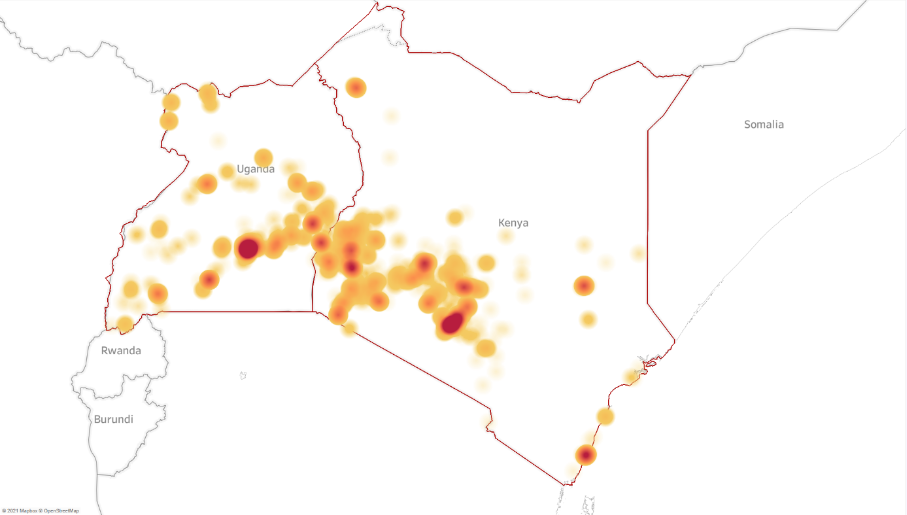 Note: The above maps plot the geographic dispersion of the collected price quotes for rice. Darker colours indicate a greater density of price quotes. Lighter colours indicate fewer price quotes.[/caption]
Most of the respondents were university students, many of whom stayed with their families across the country during the year studied, and staff/network members of NGOs. Volunteers recorded prices for essential food items in an online form, - either during or after visiting a shop in-person or getting deliveries. Statistical bureau's like the US Bureau of Labour Statistics reported challenges in collecting vital food price data during the pandemic. Complementary and, timely data collection through non-traditional channels can thus be a vital tool to track prices in a rapidly changing and uncertain environment. A limitation of our approach lies in the challenge of collecting data in particularly remote regions that have limited internet connectivity.
Figure 2: Population density and the number of collected price quotes across space
[caption id="attachment_40119" align="aligncenter" width="2501"]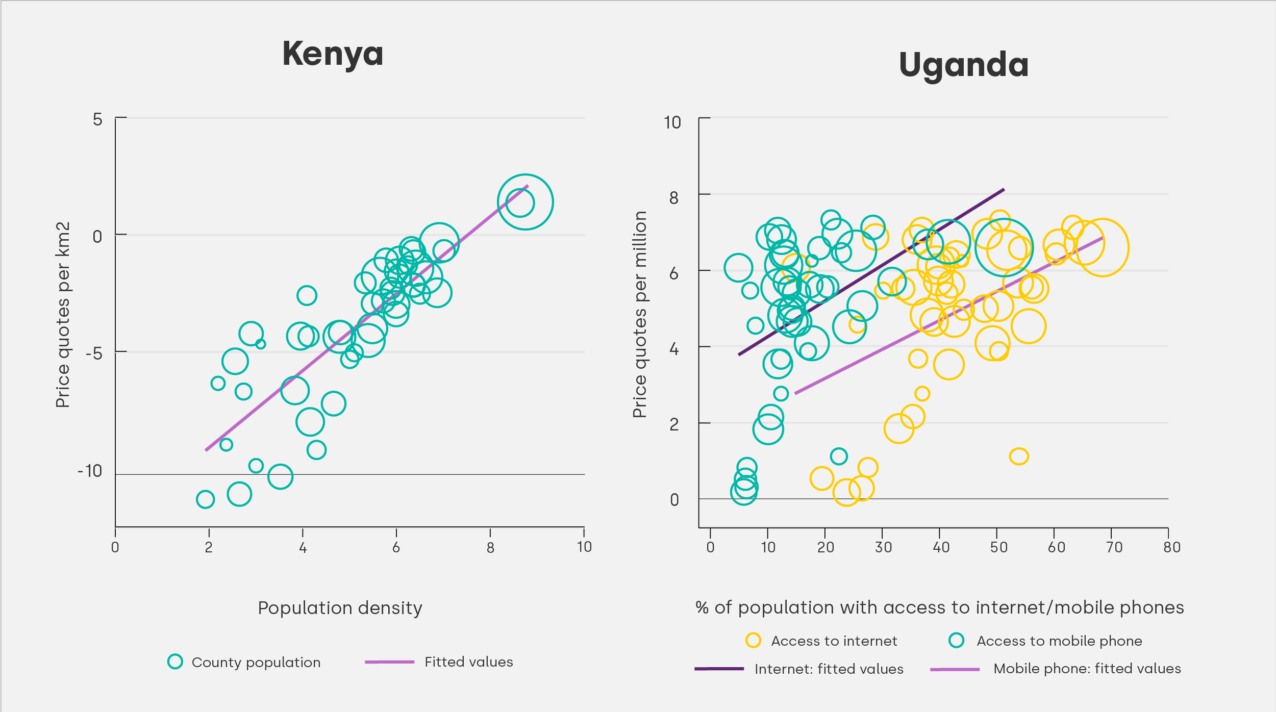 Note: The above graphs plot the log number of price quotes (per km2/per million people) collected in each Kenyan county on the y-axis. In the left graph we plot it against population density and in the right graph against the percentage of the population with access to a mobile phone and Internet respectively. Each marker represents one of Kenya’s 47 counties. The size of each marker is proportional to the county’s population. The slope of the fitted line is slightly steeper than a 45°line, suggesting a disproportionately higher concentration of price quotes in densely populated counties. The population data and information on Internet access and mobile phone access are sourced from the 2019 Population and Housing Census by the Kenya National Bureau of Statistics. Unfortunately, we lack the relevant district-level population density and mobile phone access data to replicate the graph for Uganda. As an alternative, we include a correlation with absolute population figures in the study report.[/caption]
This can be addressed in future data collection endeavours through more targeted recruiting of volunteers in relevant areas. Additionally, more crude measures (for example, number of fruits) instead of standardised measures (for example, kilogram) have to be used for items like fruits and vegetables. This is an important aspect to keep in mind for the interpretation of the data. Nevertheless, the study report shows that the trends in the data on fruits and vegetables prices are closely aligned with those collected through traditional channels by the Uganda Bureau of Statistics and the Kenya Bureau of Statistics.
How lockdown policies impacted prices?
Unsurprisingly, the economic impact of the pandemic did affect prices. Prices were higher during the initial weeks of shutdown orders to contain the spread of COVID-19 in Kenya and Uganda. Due to the long-lived and more stringent nature of the lockdown, the impact seems to have been more pronounced in Uganda. In Kenya, we find that prices remained relatively lower for an extended period after the end of the lockdown. While we cannot rule out a partial role of seasonality, this finding is likely driven by the sustained reduction in household incomes due to the pandemic and the associated economic shock (see Pape et al. 2020 and Kasiime et al. 2021). As shown in figure 2, price trends in Greater Nairobi and Mombasa, which had seen additional travel restrictions early on in the pandemic, followed a similar trend as prices in the rest of Kenya. In Uganda, prices remained elevated until July 2020 in the 40 border districts that had prolonged lockdown measures imposed. However, the same pattern is also observed for the Greater Kampala region, which had the most stringent measures lifted in late May 2020.
Figure 3: Price dynamics for different localities across time
[caption id="attachment_40117" align="aligncenter" width="2500"]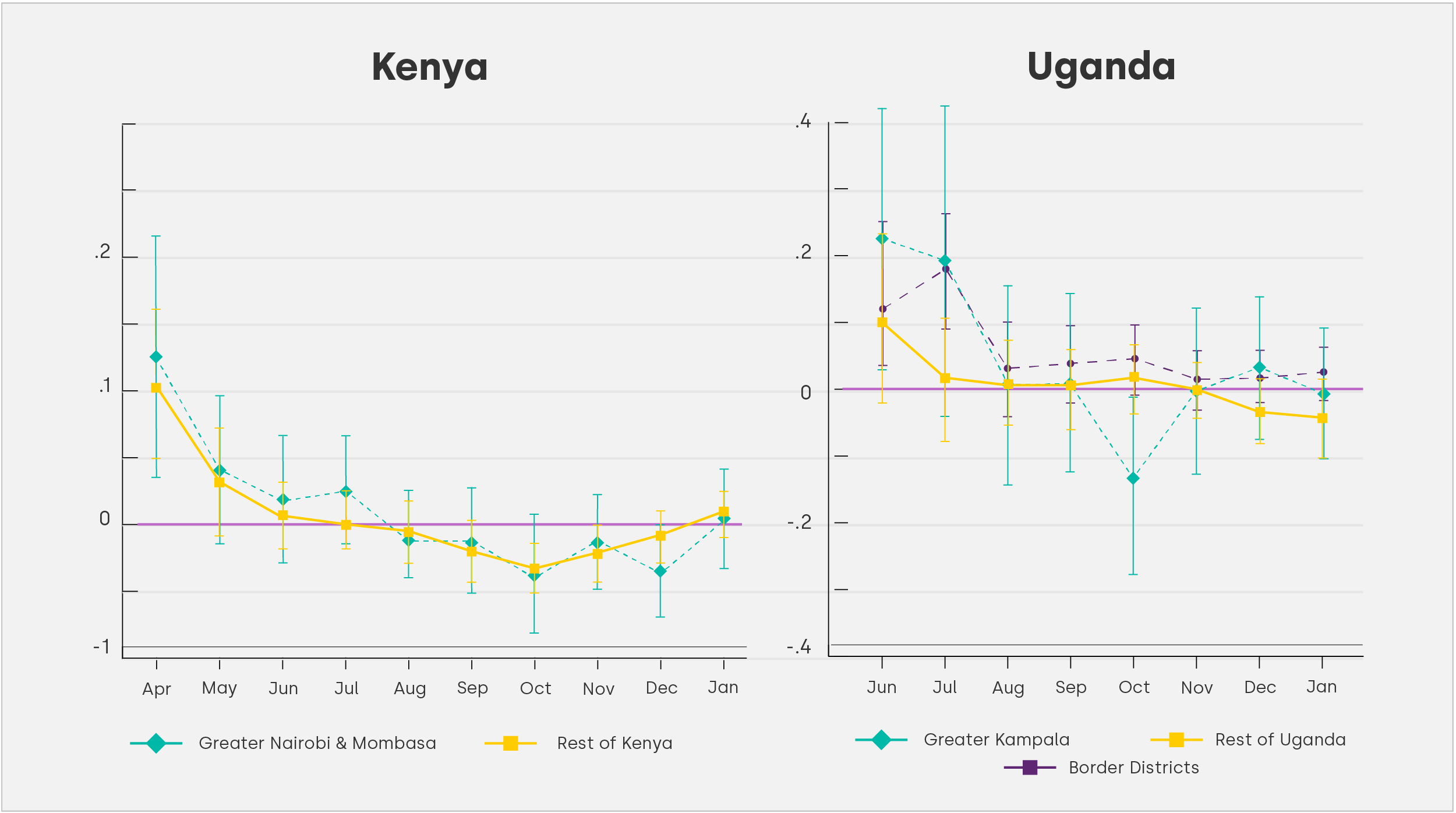 Note: In the above graphs we regress the log price on a series of monthly time dummies. We further include item, brand and county/district fixed effects. Prices are winsorised at the 1% level. Standard errors are clustered at the item-district level. The error bars show the 95% confidence intervals. In Kenya, we distinguish between the Rest of Kenya and Greater Nairobi and Mombasa, which have seen travel restrictions imposed between 6 April and 7 July, 2020. In Uganda, we distinguish between Greater Kampala, the border districts which were under prolonged lockdowns, and the rest of Uganda. For Kenya, the data covers the time period between the last week of March 2020 until the first week of March 2021. For Uganda, the data covers the time period between the last week of May 2020 until the second week of March 2021.[/caption]
Mobility patterns as drivers of price dynamics
Lockdown measures are by far not the only driver of economic outcomes during the pandemic. Changes in consumption and mobility patterns can equally impact price dynamics. This can occur, but can importantly also be driven by the sustained adverse impact of the pandemic on income generating activities. Furthermore, post-lockdown mobility patterns might drive business decisions to re-open. These changes are reflected in visiting patterns of smartphone users. Since the start of the pandemic Google has published daily data on changes in visiting patterns of smartphone users at locations like workplaces, grocery and other retail stores at the county (Kenya) and district (Uganda) level.
Figure 4: Variation in activity levels across different categories of locations
[caption id="attachment_40118" align="aligncenter" width="2501"]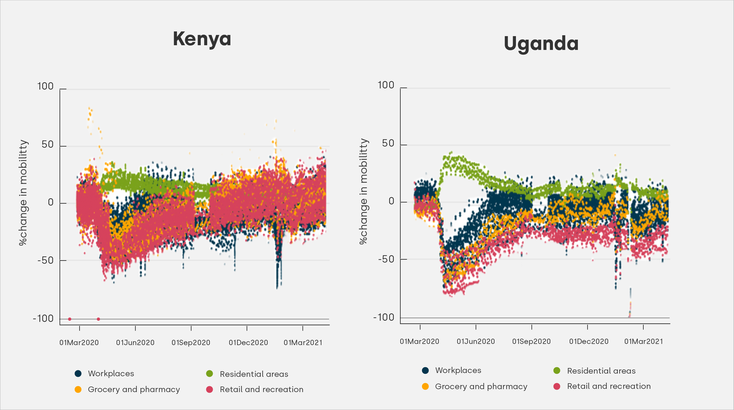 Note: The graphs compare the variation in activity levels across time for three different Google mobility indices. The daily index is reported at the county level in Kenya and at the district level in Uganda. Each dot represents a county-day (district-day) observation. The data are sourced from: https://www.google.com/covid19/mobility/[/caption]
For each day the mobilities indices capture the percentage change in activity relative to the median activity level on the same weekdays during a five week baseline period in January and February 2020. Figure 4, shows the evolution of changes in activity levels for both Kenya and Uganda between March 2020 and March 2021. The most drastic change for both countries is picked up in April when government-imposed restrictions were at their height. While the drop off is rather sudden – particularly in Uganda – the recovery is more gradual and stretches over several months.
Figure 5: Price dynamics and mobility
[caption id="attachment_40122" align="aligncenter" width="901"]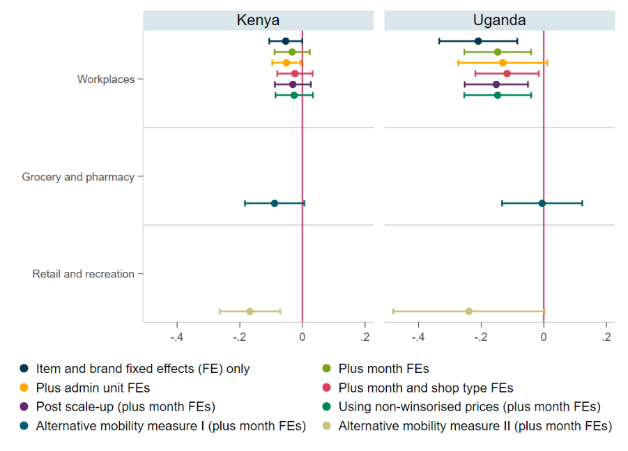 Note: The graph summarises the results for eight alternative specifications where we regress the log price on the Google mobility index (workplace). We control for item and brand fixed effects in all specifications, and for month fixed effects in most other specifications. The error bars show the 95\% confidence intervals. Standard errors are clustered at the item-district/county level. Prices are winsorised at the 1\% level. The Google mobility index captures the level of activity at the specified location category relative to a baseline period in January and February 2020.[/caption]
This data can be easily linked with the high-frequency price data. In contrast to the more short-lived impact of the lockdown measures, changes in mobility patterns continued to drive price dynamics beyond the initial lockdown phase. Interestingly, retail prices increase as the level of activity at workplaces, grocery, and retail stores declines. A 10 percentage point reduction in activities at workplace locations corresponds to a 0.3% and 1.4% increase in food prices in Kenya and Uganda respectively. As shown in figure 5, the results are stable across a number of robustness checks, although we cannot rule out that the effect is indeed zero in Kenya. In Uganda, we find that prices for imported products follow a different pattern, where prices rise with an increase in mobility.