
What the heck is happening in the developing world?
Projecting global energy consumption patterns have historically been difficult. Much of the recent growth in demand for energy has come from developing countries. Addressing security challenges in the future will require researchers to have a better understanding of the drivers of energy consumption in developing countries.
One of the most important energy graphs these days shows actual and projected energy consumption in the world, separated between developed and developing countries. A version based on data from the Energy Information Administration (EIA) is below.
figure 1
The vertical axis measures total energy consumption, including gasoline, diesel, natural gas, electricity from all sources, etc. – all converted to a common unit of energy (the Btu, or British Thermal Unit). It reflects commercial energy sources, but excludes things like firewood that people collect on their own. The horizontal axis plots time, and the straight lines reflect historical (actual) data while the dotted lines reflect projections.
Strikingly, the developing world – approximated on the graph as countries that are not members of the OECD – has already passed the developed world (in 2007) and is projected to consume almost twice as much energy by 2040.
To me, this suggests strongly that anyone worried about world energy issues – including climate change, oil prices, etc. – should be focusing on the developing world.
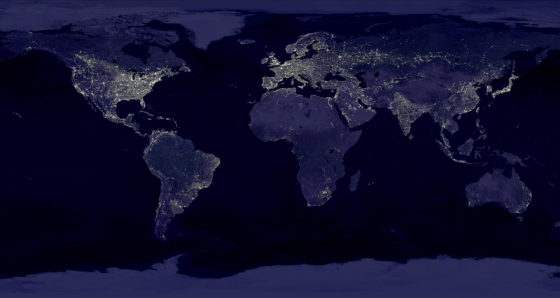
World Nightlights
Image credit: NASA/GSFC
Unfortunately, I fear that we know woefully little about energy consumption in the developing world. The series of graphs below depicts our ignorance starkly.
Let’s start with China, which single-handedly consumed 22% of world energy in 2013 (still far less per capita than in the US). The vertical axis again plots total energy consumption, but this time it’s measured relative to 1990 levels. The black line plots actual numbers. For example, since the black line is at 3.5 in 2010, that means that by 2010, China was consuming 3.5 times more energy than it had in 1990. Pretty amazing growth! By comparison, US consumption in 2010 was only 15% higher than 1990 levels.
Figure 2
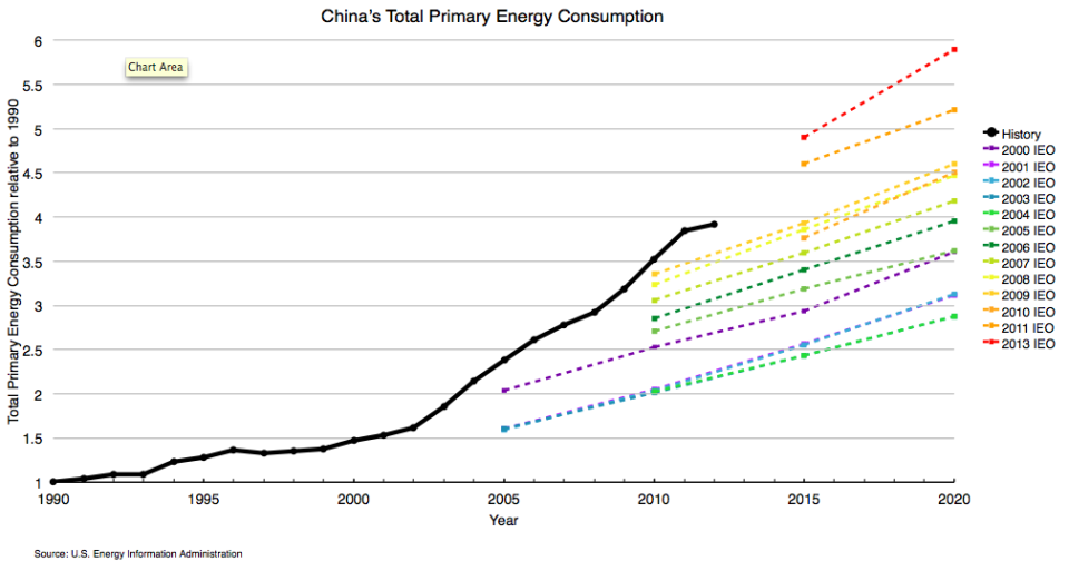
The colored lines on the graph depict the EIA’s projections, published in different annual issues of the International Energy Outlook (IEO). If you stare at 2010, 2015 and 2020, you see that the EIA has revised its projections upward considerably over a relatively short time period.
I fear that we are underestimating the 25-year out projections, just like we’ve underestimated recent trends.
Start with the light blue line at the bottom, which reflects projections that were part of the 2002 IEO. At that time, the EIA thought China would only consume twice as much energy in 2010 as it did in 1990. But, China’s actual consumption surpassed that level midway through 2003, 6.5 years earlier than projected. So, by 2005, the EIA had increased their projection for 2010 by 30%. That’s a huge upward revision.
But it wasn’t nearly enough. The EIA continued to increase its projection, struggling to keep up with China’s actual growth.
Ah, you say. This is just a story about China, where there are lots of possible explanations for underestimated growth in energy, including faster than expected GDP growth, rapid industrialisation, etc.
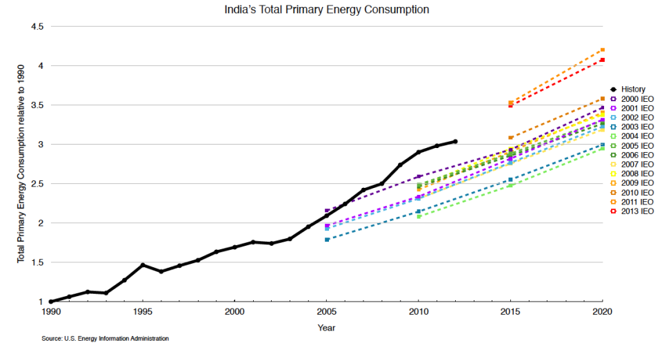
But, similar stories emerge for Africa and India. The EIA has recently revised projections pretty dramatically, and most of the revisions are upwards.
Figure 3
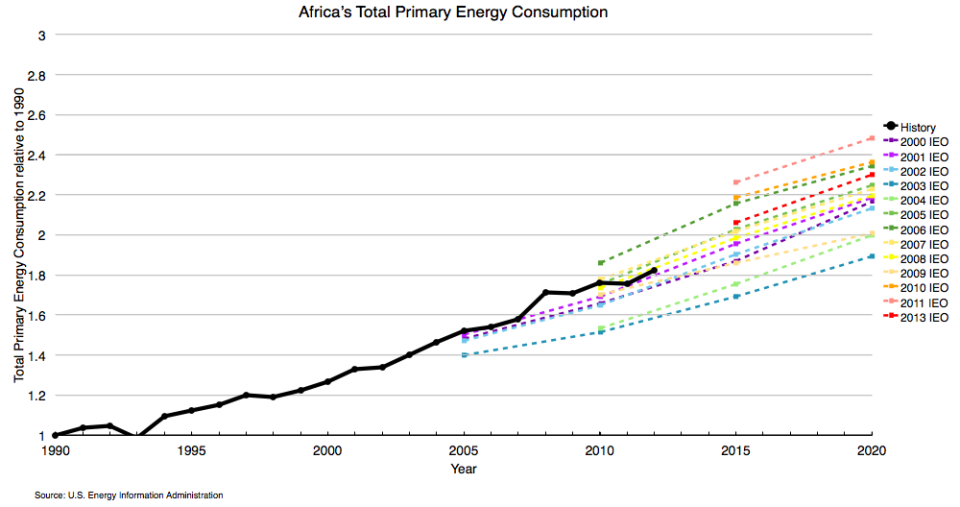
Finally, for India more than Africa, the projections have been too low.
Figure 4
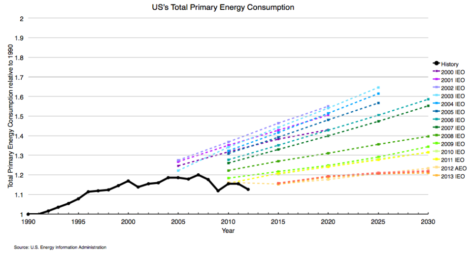
And, this is not a problem in the developed world. The figure below contains a similar graph for the US. Note that the scale is different than for the developing regions, so the revisions have been pretty minuscule in comparison. Also, they’ve generally been downward.
A couple points to keep in mind:
- It may seem like I’m picking on the EIA. I’m not trying to. They are doing an incredibly important job with very few resources. (The International Energy Outlook was recently demoted from an annual publication to approximately biannual.) Also, the EIA are not alone. The International Energy Agency and BP – two other big names in world energy reporting – have also had to revise projections upward to keep up with energy demand in developing countries.
- The EIA and other organisations are careful not to describe their projections as forecasts. The EIA, for example, notes that, “potential impacts of pending or proposed legislation, regulations, and standards are not reflected in the projections.” I doubt that omission explains the discrepancies in the developing regions, though. I have tried to back out how much of the underestimate is due to misjudged GDP growth, and I don’t think that’s a big share either, at least in China. I suspect that we need a better underlying model for how GDP translates to energy consumption in the developing world, the point of this academic paper.
- Policymakers in the developing world appear to appreciate this issue. We recently launched a 5-year research project, funded by the Department for International Development (the UK’s analog of USAID) and joint with Oxford Policy Management, to study energy in the developing world, focusing on sub-Saharan Africa and South Asia. As part of this project, we hosted a policy conference in Dar es Salaam to hear from East African policymakers about the pressing issues they faced. One of the main themes that emerged was the difficulty of planning without better demand forecasts.
- Some might argue that markets will solve this problem. The EIA is just some government agency that few are paying attention to, or so the argument might go. If you have real money at stake in understanding future energy consumption in the developing world, you would not hire someone who was off by 75% (3.5 divided by 2).
I do not know who is using the EIA projections for what, but I believe this logic breaks down for several reasons. For one, in many parts of the world, the private sector is not investing in energy infrastructure and the public sector may be relying on organisations like the EIA. Also, most investors don’t really care about 2040. Their discount rates are high enough that it doesn’t really matter what’s happening 25 years out. But, from the perspective of climate change, the world should care about energy consumption in 2040, 2050 and 2100.
This brings us back to the first graph in the post, which contained projections out to 2040. I fear that we are underestimating the 25-year out projections, just like we’ve underestimated recent trends. As researchers, we need to get under the hood and understand more about what is driving energy consumption in the developing world.
This blog was originally posted on EnergyAtHaas, read the original here.